
Showing posts with label Ancillary. Show all posts
Showing posts with label Ancillary. Show all posts
Sunday, 8 May 2011

Digipak Designs


Monday, 14 March 2011
Magazine Advert analysis
I chose the brown paper idea as I think it has a nostalgic quality that reflects the mood of the song. The track I chose takes several influences from retro music, and I think that using the brown paper implies that. It also has the symbolic connotation of being a gift, tying into the idea that the help given by the red men is a gift to my character.
I think, presented on a page, this would stand out in comparrison to other styles of advert. It seems to me that the technique of black background, white writing is a little over used and is no longer as effective. I think the fact that my advert looks as if it has a texture will encourage the reader to pay closer attention to the advert, and encourage them to touch it.
I chose to include reviews and comments on the advert, obeying the conventions I have seen in other promotions. Although it is a commonly used convention, I think it still is good to include. I know from personal experience that I tend not to trust an advert when there aren't at least a few possitive reviews.
Monday, 31 January 2011
The real Digipak
I've just found the Digipak used for the album the song I'm using comes from, so I thought it would be good to look at for some inspiration. Capturing the feel of not only the song, but the artist as well is very important.

I like this Digipak a lot. It has a very cool, urban, New York look to it. It's interesting that they featured the artist quite clearly but I think this works well; his look compliments that of the album cover. It makes sense, listening to the music on the album and the song I have chosen, that they would choose a style like this. It's simple, a single image with a bit of text, but it still captures style and feel of the music well, and represents what inside in an easy to understand format.

I like this Digipak a lot. It has a very cool, urban, New York look to it. It's interesting that they featured the artist quite clearly but I think this works well; his look compliments that of the album cover. It makes sense, listening to the music on the album and the song I have chosen, that they would choose a style like this. It's simple, a single image with a bit of text, but it still captures style and feel of the music well, and represents what inside in an easy to understand format.
Wednesday, 24 November 2010
65daysofstatic (Ancillary Task)
65daysofstatic are a band I really like. They are particularly well known for their effective and interesting album covers. They are a band that have built up a reputation for their arty and mysterious image.
Here are some of their album and single covers:

You can see that they aren't really linking by any running theme or style, but are more based in an intriguing central image, presented simply. The band name and titles are discrete and do no detract from the image.
Friday, 22 October 2010
Oh wait, we have to do an Ancillary task!
So, I recently was reminded that aside from the video itself we also have to produce an Ancillary piece in the form of a CD Digipak. But what is a Digipak?
In basic terms, a Digipak is a paper version of traditional plastic jewel case that most CDs are sold in. Here are a few examples:


In basic terms, a Digipak is a paper version of traditional plastic jewel case that most CDs are sold in. Here are a few examples:
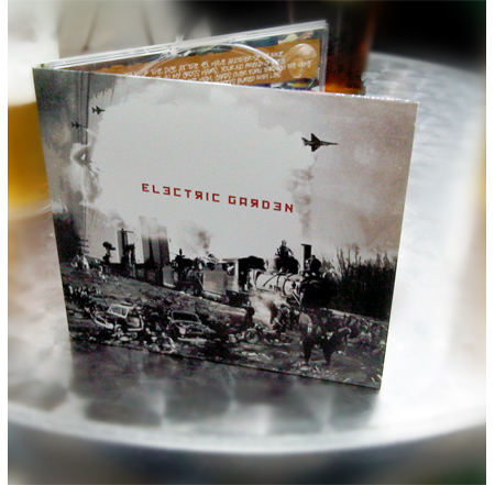

The music industry is now split between digipak and jewel cases. Many prefer digipaks due the the jewel cases tendency to break.
What exactly is it that makes a sucessful album cover design? This is a selection of some of the best covers of all time: http://www.wired.com/underwire/2010/06/gallery-album-covers/
Looking through them, it seems that there isn't one unifying theme that links them. They vary drastically in complexity and subject matter. Mostly, it seems that a successful cover has to continue the feel of the music itself. A lot of what the cover looks like seems to be dictated by the style or genre of the album. This is something I will have to think about when I am creating my design. It needs to work with the song, not against it.
Subscribe to:
Posts (Atom)